
Games Workshop Contrast Paints: Part 4 - One Step Beyond.

Gosh, time sure flies when you are having fun. Two whole months since part 3 of the series and we are finally back with the promised part 4!
Can Contrast Paints help with something Kris has always found intimidating, painting a primarily white colour scheme.
Well, this took a little longer than I expected, and whilst some of it was due to idiocy on my part (forgetting to take pictures at important stages...) I will shift some of the blame onto having to complete some painting commissions that had the deadlines shifted around...
OK, that's enough excuses and on to the actual article.
As promised, I have been working on some Steal Phalanx models for infinity and whilst I have owned these miniatures for about 7 years, I have been put off starting the project as the studio colour scheme just looked so intimidating...
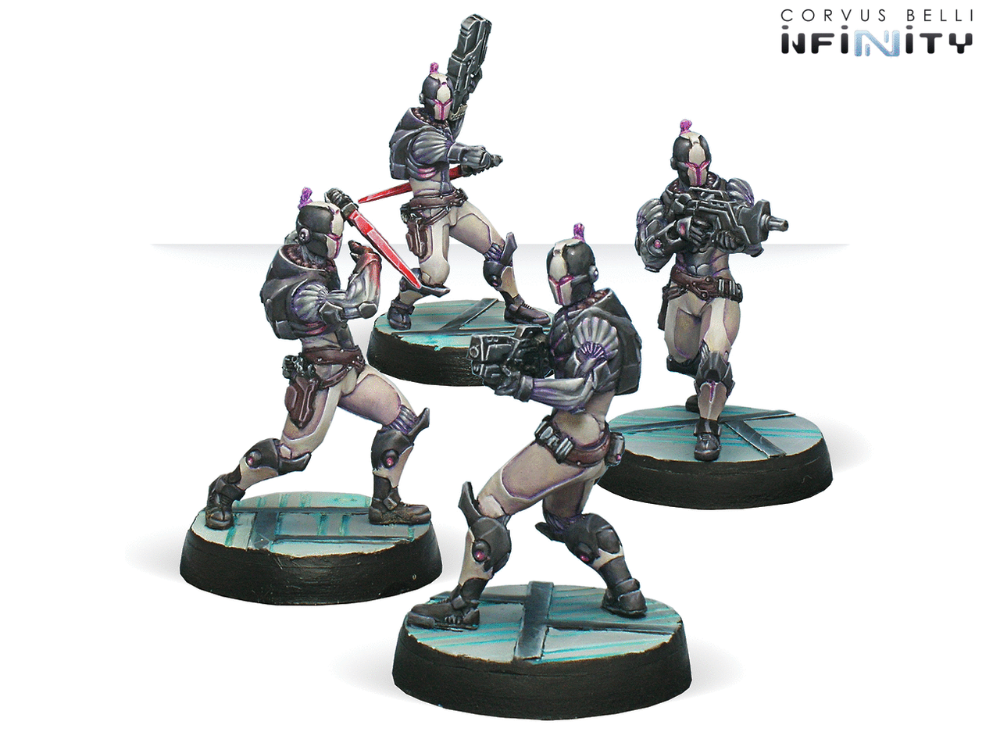
I really like the off white and how it interacts with the pinks and purples but man it looks hard to do...
I don't mind deviating for the box colours for an army, and always like to put my own take on it somewhere but I really wanted to core of the army to look white with the cool purples and pinks that I never get to paint with on most projects, but I also didn't want to dedicate the time I knew it would take to get a look I would be happy with...
So, what was the answer, practice on other stuff and see what I could achieve.
The first model I attempted where I really tried to do a white colour scheme was for a long out of production miniatures game called Anima: Tactics. I love this line of miniatures and still have a truck load of them bundled away for painting projects. They are really evocative miniatures and I tend to gravitate towards them for different D&D characters and stuff like that as the just ooze character. (I feel like there is another article series there looking at alternative miniatures, lets bank that one for later!)
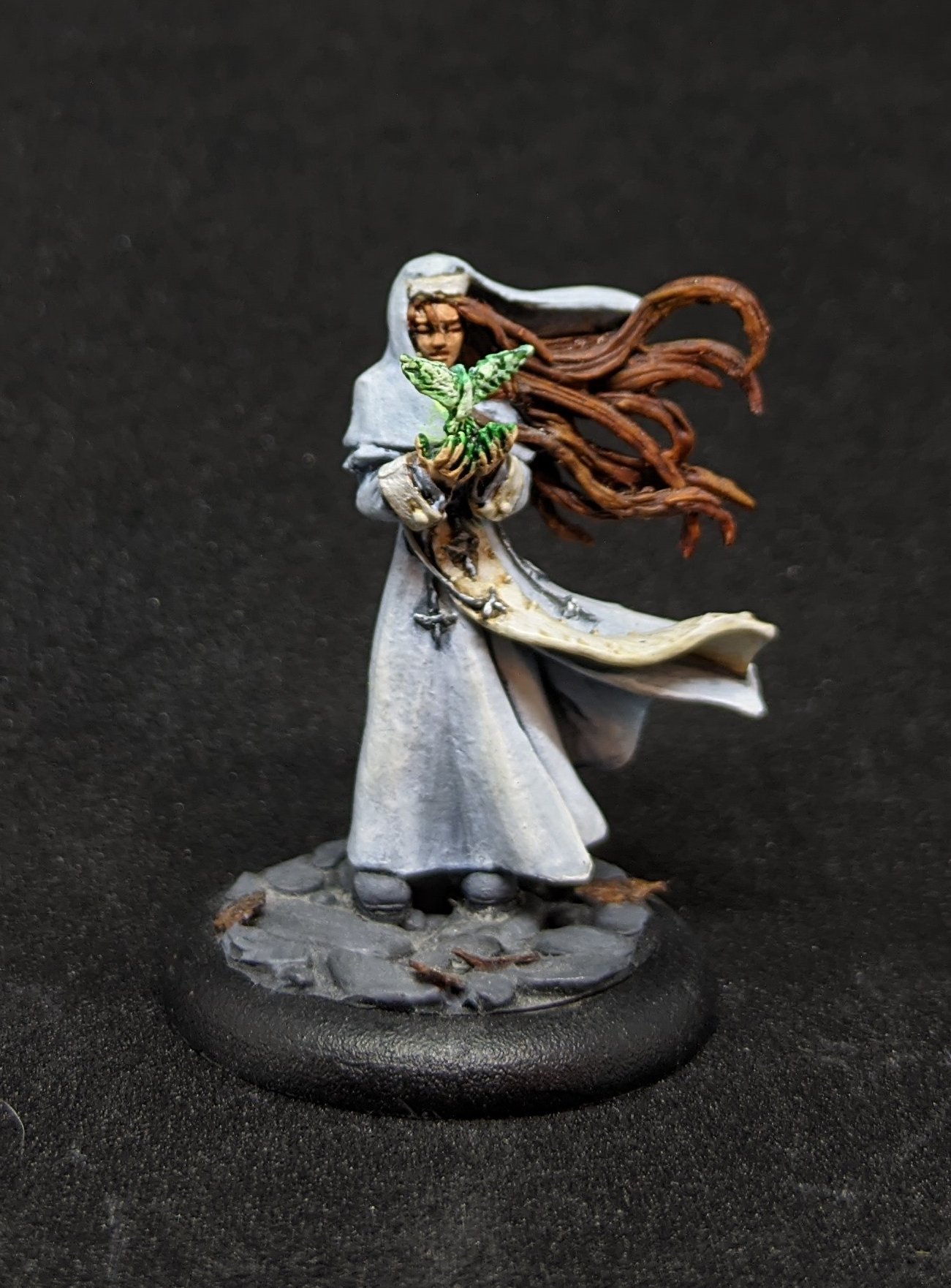
Sister Evangeline just embodies Revivify and Heals...
I was really happy with this model, but it did nothing to inspire my confidence in painting an entire force as it took an extremely long time with a copious amount of wet blending to get anything like a smooth transition. I really love the final look on the white robes but that approach was just not going to cut it.
Next I wanted to see if I could shortcut some of the steps and see what it would look like if I used all of my old cheats but just on a white model.

The old shade and dry brush gives some interesting results with white paint...
This model is a kit bash from a few Games Workshop parts, she is an Inquisitor in one of my Dark Heresy Campaigns from a while ago had been suffering from the same issues as the Steel Phalanx, I had described her as wearing a suit of pristine white power armour and I never found myself with the time I had put in to Sister Evangeline, but I decided to just start.
She lived on the back of my painting desk as my inbetween project for a long time but progress was being made. (Who else has a model or two that just sits getting a couple of brush strokes while waiting for other stuff to dry, or when you have an extra 5 minutes with nothing else to do, it's a great way to make progress on those projects that you can never quite prioritize.)
In the end I settled on white, Nuln Oil wash, then dry brush, then a watered down wash again and then a highlight. The picture really captures how patchy the result it up close and while she looks fine on the table, and would have been quick enough that I would have been happy with the time investment, it was a little rougher than I wanted the army to look.
Jump to the end of Article 3, I had already done a couple of test models with the contrast paints and was happy that I thought I could pull it off and show off Contrast Paints at the same time.
The Thorakitai were the test models.
Initially, I was going White in to Apothecary White and then trying to shade in some colours in the recesses which I think shows up really well on Nesaie Alkê in the front of this picture, especially around her knees.
But for this tutorial I am going to be cutting that step out to show you a slightly different result.
The Tutorial model was supposed to be Achilles but I missed a few steps in the photos... so instead, we will tackle Thamyris The Aoidos, there is lots of armour around the chest and shoulders to try to show off the technique so lets get in to it.

Make sure you get a smooth coverage using a light spray, doing multiple layers.
I have been using Army Painter Matte White Primer over GW Corax White as I have found that the Army Painter Primer has a similar texture and feel to the Contrast Primers that GW makes, whilst maintaining that Crisp White that I wanted as the base.
Whilst I have other projects to show off using the GW White, it has an almost powdery grey feel when working in this way, so if you want to try this at home, I really do recommend the Army Painter White for this specific way of using Contrast Paints.
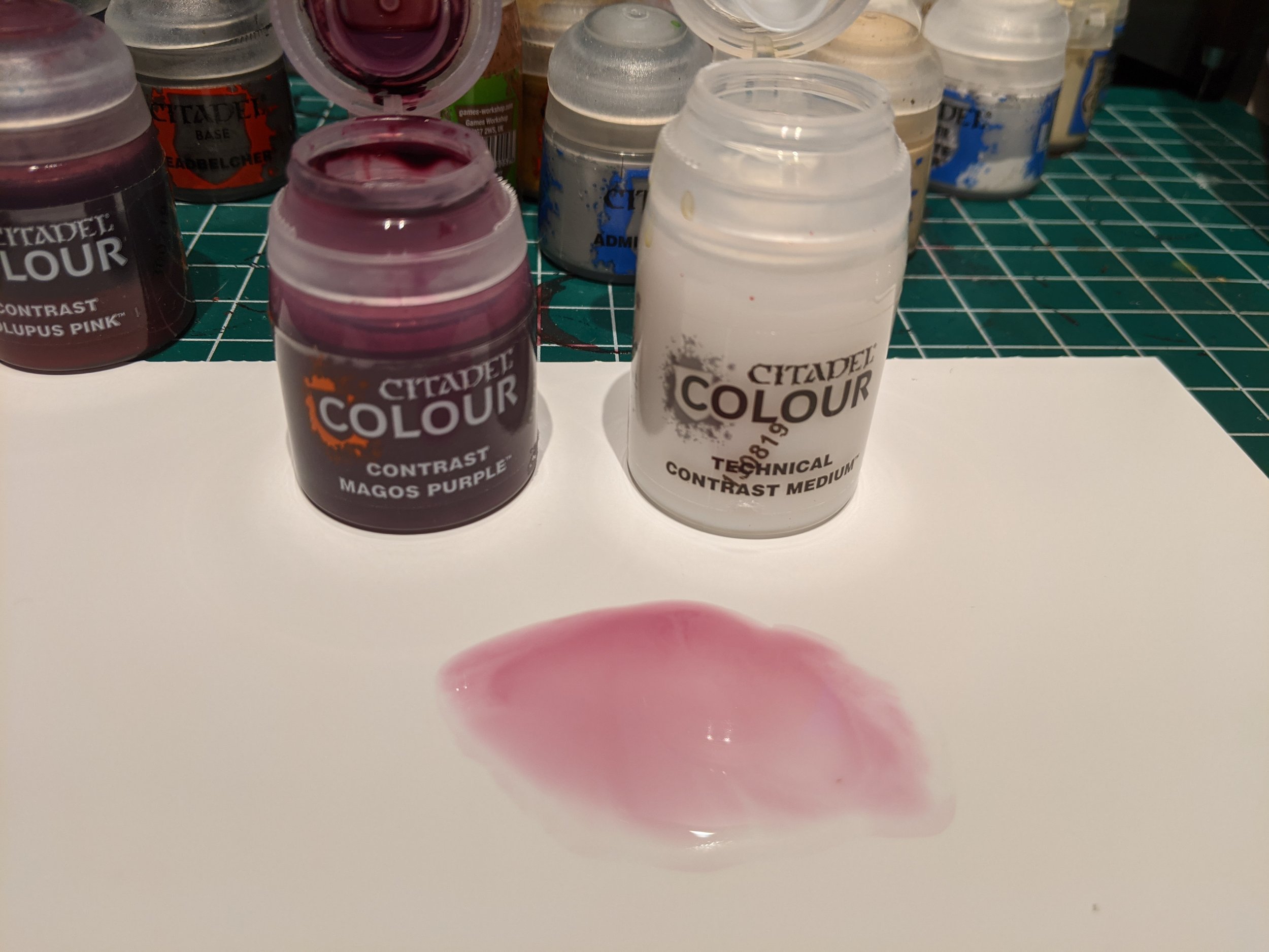
I recommend using a clean pallet for this part, I am a fan of the GW Palette Pad, but if you use a tile or an old plate make sure you clean it before you start.
I think this is our first time really looking at the Contrast Medium that Games Workshop released alongside the Contrat Paint Range and I can't stress enough how essential it is to being able to get consistent results from your contrast paints.
Using water to thin them down just does not work as the paint reacts in a weird way, where as the Contrast Medium honestly makes a world of difference.
For this project, we are going to start with a 1:3 ratio of Magos Purple to Contrast Medium that should give you a very light off pink tone. Layer the mix over the Armour Plates as if you were painting a normal base coat, this is not a shade, we are not trying to pool it, just paint it on normally aiming for smooth, even coverage.
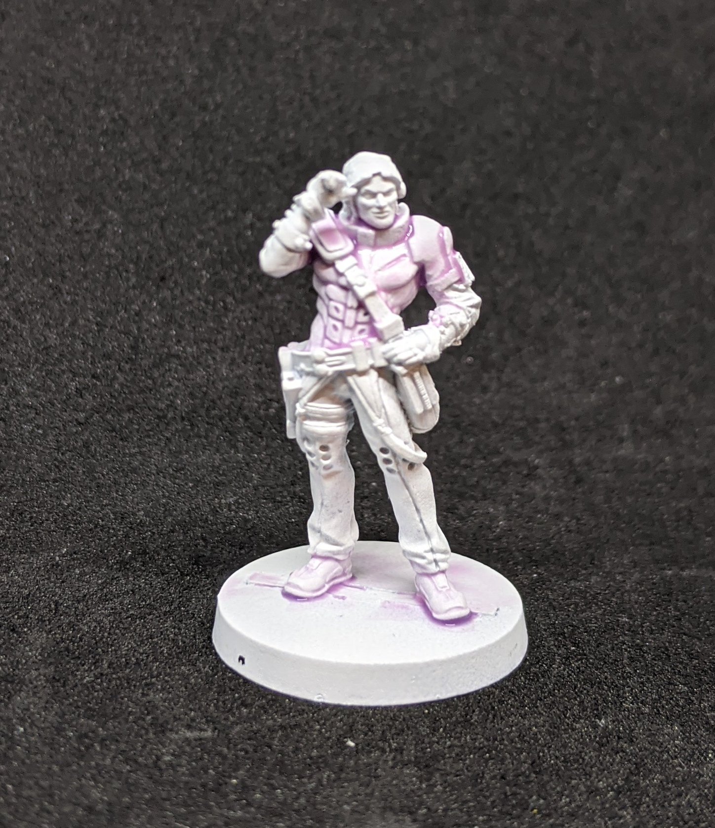
First layer done!
The mix will naturally work its magic and whilst not acting exactly like a shade it will gather and give the colour we are looking for to the correct areas.
This next step is important!
Just walk away!!!
Normally, when working on a single model, I would work on an area of the model that I had not touched and do the base coats on that, but to get the best effect, I have found that allowing the contrast to dry undisturbed gives the best results.
If you are batch painting, this should not be an issue, but if you are working on a single model, this is a perfect time for that back of the painting desk model I mentioned earlier to have some work done on them...
Paint by numbers...
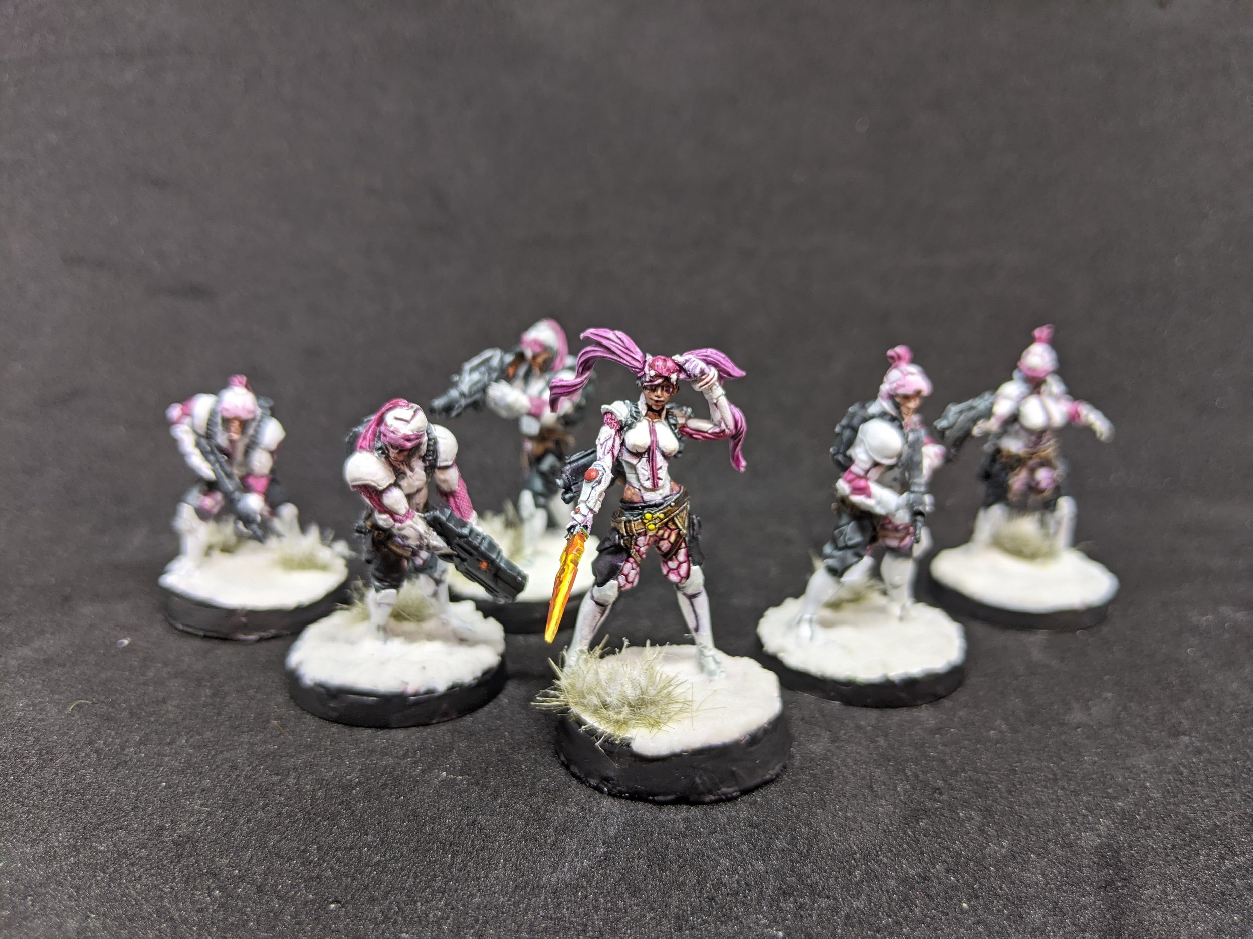
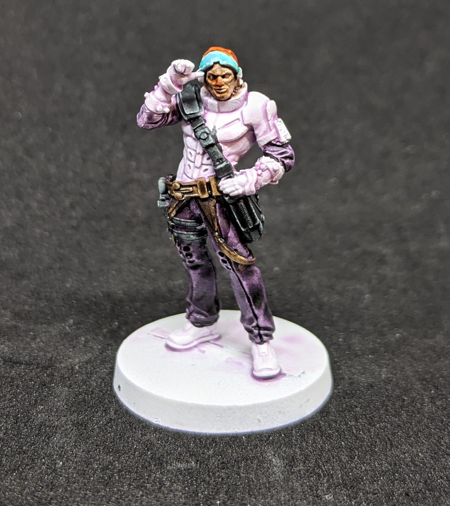
For the rest of the base coats I just blocked them in with the Contrast Colours as above all else, I wanted this project to be my first real Contrast Paint Army:
Satchel and Side Arm - Black Templar
Trousers and Undersuit - Shyish Purple
Belt and Straps - Gore-Grunta Fur
Face - Guilliman Flesh
Hair - Gryph-Hound Orange
Visor - Aethermatic Blue
I have seen complaints about Contrast Paints and how they can give a washed out look, and the only time I have found this to be an issue is with the Flesh, I do like a richer colour to the faces so that tends to get some more aggressive highlights, or even just repainted, but I still tend to put the contrast paint down just for completion's sake...
The effect really shows up well in this shot.
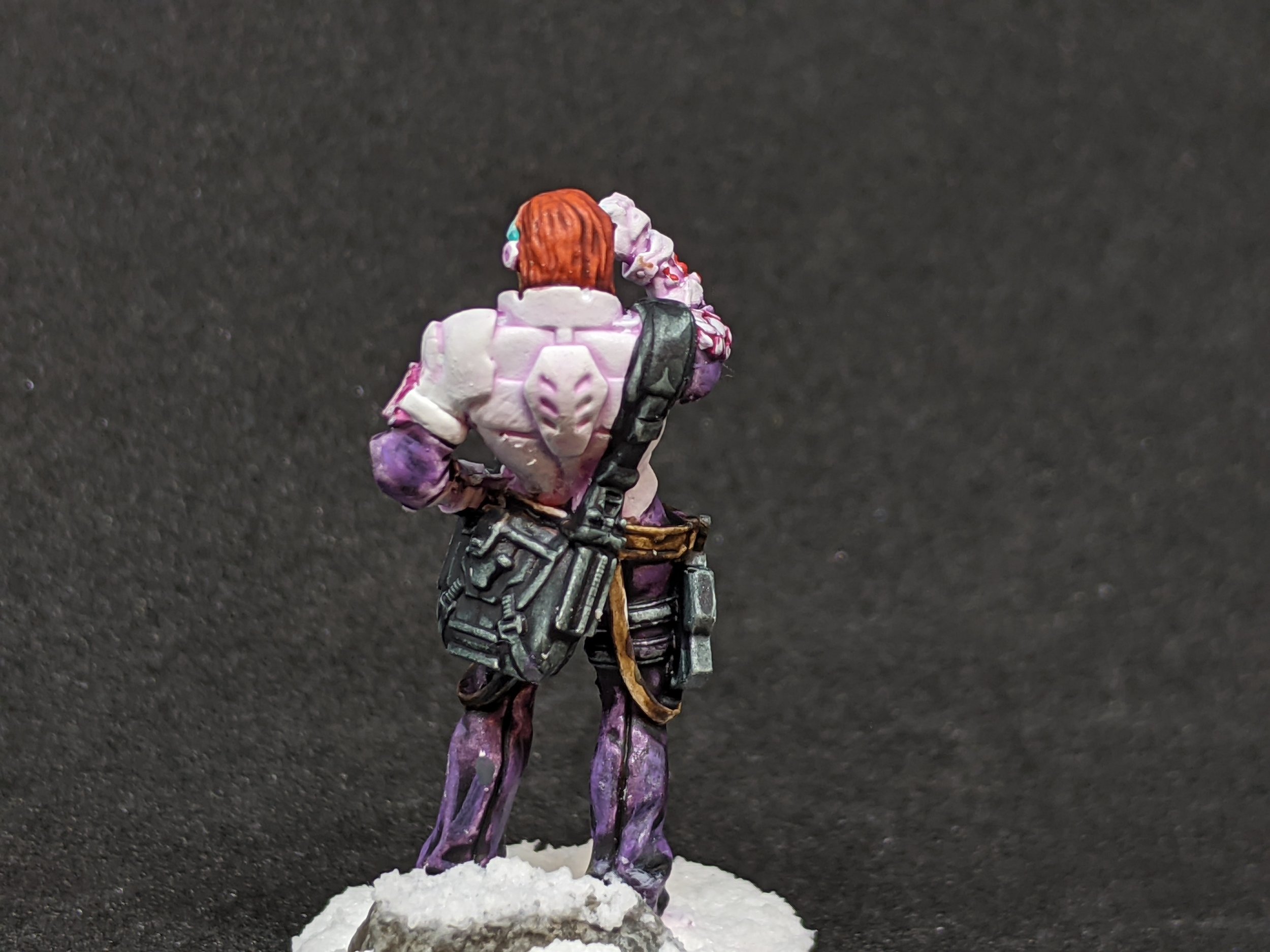
Next up we highlight the armour in white, I used White Scar as I had my GW paints out anyway but everyone has their own preference. My focus was to smooth out any areas where the contrast mix had not quite worked and to push a slightly more defined transition in to the edges of the armour.
The plates around the shoulder and the middle of the back really show off what I am trying to say, working backwards from the edge and in to the deeper colour so that you have more control over the brush. Hopefully it should go without saying but thin down your paint here to avoid any patchness, I used a 1:1 ratio of White Scar to Lahmian Medium but I know some people actually like to use the Air Paints from GW for this type of work as they are already thinner.
How you doin'?
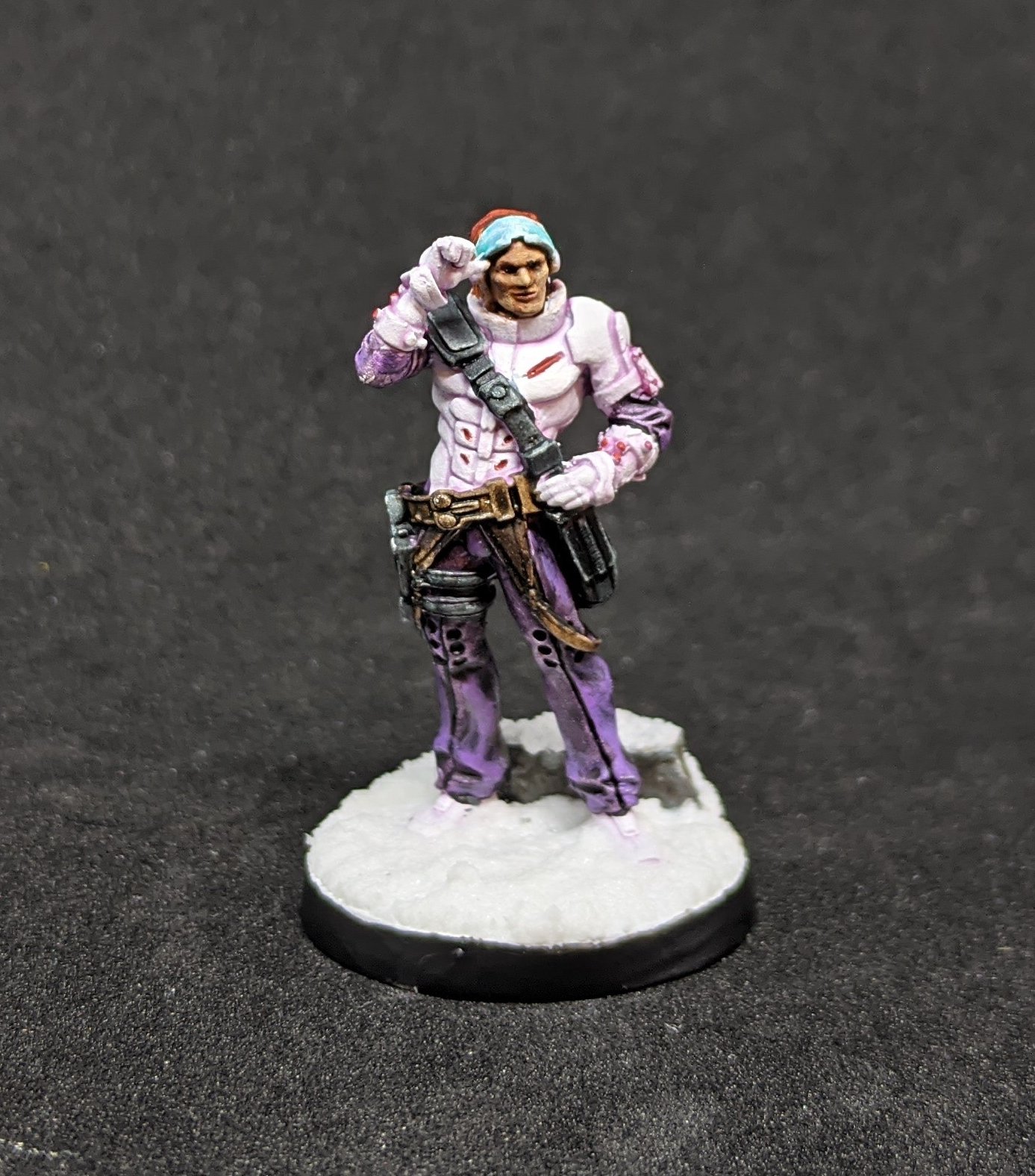
To finish off the figure, I did repaint the face with a hybrid method, I highlight quite aggressively with Cadian Fleshtone, the was with Reikland Fleshshade and then do some point highlights to accentuate any facial features, in this case, the nose, cheekbones, upper lip and chin.
The trousers and undersuit got some highlights to accentuate the flow of the folds in the fabric where the contrast had not quite sat correctly using Xereus Purple. Wild Rider Red was used as an accent colour and the visor had some refraction added using the watered down White Scar.
Everything else is just the single coat of Contrast Paint.


For the Basing, I am not convinced that I made the correct choice for the colour scheme and am contemplating swapping to a dark industrial base, but if you like it, it's fairly easy Valhallan Blizzard liberally applied and either rocks or snowy grass tufts added.
But there you have it, that's how I have been painting my Aleph Steel Phalanx for Infinity!
I am happy with the time investment to overall look of the army and whilst I still have about half the force to do, you can follow me on Instagram if you want to follow along!
If you are enjoying this series, fear not, for I am already well underway on a fun project where I use GW Corax White as the base so you can see the difference and we make it really easy to give variance whilst batch painting, without adding too much to the time, so check back for Part 5 where we batch paint some Nurgle Daemons!