
Victory at Sea: Battle for the Pacific - Painting the Ships

Following on from Howard's First Thoughts on Warlord Game's new Victory at Sea, we have Howard walking us through how he painted up the stores Demo Ships.
From the experience I got painting my GHQ ships for the first edition of Victory at Sea, I felt I could use a fairly quick and easy method to get these models ready for the table top. I’m basically going to apply several dry brushed colours, pick out the details as needed and then use Army Painter’s Dark Tone wash to apply shadows around everything.
Both navies were known to use camouflage, with the Americans using broad areas of blues and greys on some ships, including blue decks even, while the Japanese very famously painted some of their carriers in a multicolour green camouflage scheme, as well as other ships. My quick research indicated that while the US cruisers did have camo applied at times, during the war period they seemed to be one standard colour and the Japanese ships were also fairly uniform.
Accordingly all ships are started with Tamiya grey spray paint to start. I already knew that I wanted the Japanese ships to look darker than the American ones, so they get an overspray of Tamiya’s “IJN Grey” spray paint and then a lighter grey drybrush followed by a very light white dry brush.
Next up is the deck colour. Over the years I have seen pictures, colour images and models of Japanese ships with a fairly red/brown deck colour. This is also a great way to help differentiate your two navies, so give some thought to both historical colour choices but also how you want your models to look.
For the Japanese I chose Vallejo Mohagany Brown 70.846 as my deck colour. In retrospect, this is a bit more red than I wanted and Flat Brown would probably have been a good choice as well. To paint the deck I carefully work the paint around the deck fittings and superstructures, leaving the grey everywhere else.
I then pick out some shrouds on the guns, where the barrels meet the turret, in a different grey colour. I paint the lifeboats white with a brown interior or upper structure, and that’s it!

First colours going onto each navy, and the different grey tones are clearly seen
The American ships are sprayed with a grey rattle can I had at home (lighter than the IJN colour) and then drybrushed with Pale Greyblue 70.907, Sky Grey 70.989 and a light drybrush with white. For the US decks I chose 70.873 US Field Drab, as it was a nice wood colour that’s distinctly different from the Japanese decks.

Again there’s a few details to pick out, including lifeboats and life rafts. The Fletcher-class destroyers and Japanese Fubuki-classes get similar treatments. From reviewing a number of photos, it appeared to me that the Fletcher had metal decks, so I didn’t use a wood colour for them, but the Fubuki’s appeared to have partial steel and wood, so I picked out some sections in wood.
Next I brushed on Army Painter Quickshade “Dark Tone” wash, covering the entire ship and ensuring I didn’t have pooling of the wash. Once the wash dried, it left lovely shadows around all the little details on the decks, all the gun turrets and secondary batteries etc.

Top ship, Quickshade applied. Bottom ship, no Quickshade
Once the Quickshade dried it was very glossy, so I sprayed dullcoat to ensure a flat finish on the ships before painting the bases with Dark Sea Blue 70.898.

Finishing off the bases, I wanted to try something a little different to impart some depth and turbulence to the water. I hadn’t tried it before, but wanted to give it a shot.
I chose German Camo Bright Green 70.833 and Prussian Blue 70.965 and first applied a wash of the green in blotches and once dry, the blue went over the top. Where the green was a little too vibrant, or the blue, I went over with a Dark Sea Blue to tone it down, but for the most part I was happy with the effect.

Mogami, top, has blue wash over the green. Kumano, bottom, has only the first green wash applied.
From here, I applied a light white dry brush. The intent was to just pick out the tops of each little wave, so it looked like wind-swept water. Next the wake of the ship was started with a thin wash of white paint and when mostly dry a little touch of green and blue washes were also mixed in, to impart the effect of depth and roiled water.
Then I picked out the larger “bow feather” waves and those pushing outward from the ship, also picking out the waves in the wake with pure white paint. Once I was content with the look of each base I cleaned up the edges with Dark Sea Blue again and then brushed on gloss varnish along the top.
Although it’s not a very pronounced effect, I like how the green and blue washes can be seen in some areas, so I think I’d keep using this method and maybe figure out how far I can push it to perhaps represent shallower water, more turquoise colours etc.
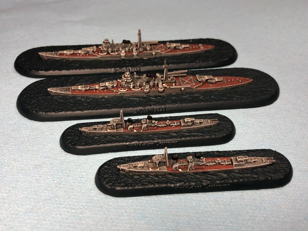
The final step was to pick out the names of each ship, at least on one side. For the larger ships the name is on one side, the class is on the other. This was very fiddly painting so I opted to just paint the name of the ship, and leave the other side in blue, and I just picked out one side of the destroyers, since it has the class name on both sides.

The finished ships! Gloss varnish gives a nice touch to the bases.

Thanks again for reading!
- Howard